5 Looker Studio Tips and Tricks
Are you still figuring out how best to review your Google Analytics (GA4) data with the new GA4 interface? Have you checked out Looker Studio and then closed the tab because you don’t have time to learn another tool? Do you find the two-month data retention period, or 14 months if you updated your preferences, hampers your data explorations in GA4?
Looker Studio provides an easier to use interface than GA4 and a longer look back window, or data retention period. Additionally, you can combine Google tools, such as GA4 and Google sheets, in one dashboard. For example, to get a better picture of how Google searches affect your site’s engagement rate, combine Google Search Console data with your GA4 data in one dashboard.
These five tips will save you time as you work with Google’s Looker Studio.
Start with a template
To avoid the pain of starting from scratch, look at Looker Studio templates and shared dashboards to find a layout that works for your data needs. Click on the vertical ellipsis to the right of the share button in the top left of the dashboard header to make a copy (fig.1). Customize your copy of the dashboard to fit your needs.
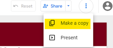
fig. 1 Customize your dashboard look
Before adding any components, set your dashboard’s theme to prevent the need to reconfigure components. The theme and layout tool can be found on the far right of the edit menu (fig. 2).

fig. 2 Customizations include allowing you to set a background color, manage your text style, and select the colors used in your chart dimensions and metrics (fig. 3). Use the layout tab to select your dashboard’s navigation placement and the dashboards height and width (in pixels).
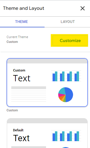
fig. 3 Build your headers or footers
Report-level components are placed in the same location on every page of your dashboard, similar to a header or footer. To make a component report-level, right click on the component to see “Make report-level” in the pop-up menu. To easily tell if the component is report-level vs. page-level, look at the color of the selection border when you click on the component. Report-level components are outlined in purple (fig. 4) and page-level components are outlined in blue (fig.5).
fig. 4 Example of a report-level component 
fig. 5 Example of a page-level component Resize column widths in tables
Tables are a popular chart type in data dashboards. To avoid spending time adjusting column widths individually in Looker Studio tables, adjust all columns at once to an optimal width by hovering your mouse over a column border and double-clicking.
Easy chart filters
Metrics in isolation rarely provide actionable insights. Use cross-filtering to see the metrics isolated to that dimension. For example, to investigate a spike in page views to your website for a specific date, filter the dashboard to show the information for that date by clicking on that date in the time-series graph.
The University Relations Measurement & Analytics Team created a sample dashboard for you to play around with. You must have a U of M Internet ID to access it. If you run into dashboard access problems, please click on the request access button. For demo purposes, the dashboard is connected to the Google Demo Account, GA4 - Google Merch Shop property.
Help guide future Google Measurement & Analytics tips and tricks blog posts by letting us know which topic you want to read about. If you have questions about Looker Studio, please reach out to nbertino@umn.edu.