This resource is available to U of M faculty, staff, and departmental accounts.
On this page:
- Google Docs, Forms, and Slides Templates
- Branded Google Sites
- Base Theme
- Setting up the Header
- Creating the Footer
- New Pages
- Related Resources
These resources are available to U of M faculty, staff, and departmental accounts.
Google Docs, Forms, and Slides Templates
Branded templates are available for Google docs, forms, and slides. Instructions for finding and using the templates can be found on this Google Templates doc.
Branded Google Sites
Use these guidelines to create an official University of Minnesota Google Site with University branding. Creation of U of M branded sites is open to faculty and staff. Google also provides instructions on the basics of creating and managing your site at Sites Help.
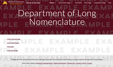
Base Theme
Currently, Google does not allow for custom themes or templates, so personalization must be done manually. To set up a site with University branding, you’ll use one of the basic themes available on Google Sites found in the right-hand column by clicking the "Themes" link. Start with the following settings:
- Select the "Simple" theme.
- Select "Light" for the font style.
- Select the custom color (the last color on the right).
- Set the color to #7a0019.
Setting up the Header
Header Type
- Hover over the header.
Select "Header Type" from the menu that appears at the bottom corner of the header.

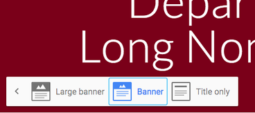
Select "Banner" or "Large banner."
Header Background
Google does not provide options to select a solid color for the header background, but it does let you upload images. The download includes 1x1px maroon and gold PNGs for the headers.
Note: If you choose to use another type of image, make sure the University marks—Block M, Wordmark, and Driven to Discover—are readable, as well as your own site name. See the readability options below.
Upload Image
- Hover over the header.
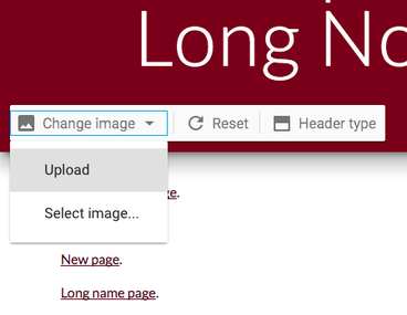
- Click "Change image" from the menu that appears at the bottom left corner of the header.
- Upload either the maroon or gold image.
Readability
Google can automatically adjust text color to ensure that it is readable on top of the background image. However, the adjustments for the gold header are not satisfactory. It is suggested to have readability off for the gold header and on for the maroon.
Toggling Readability
Readability adjustment on.

Readability adjustment off.

- When hovering over the header, stars should appear in the bottom right corner. A slash should appear through the stars to indicate that readability is turned off.
- Click the stars to toggle readability.
Header Wordmark
- Hover over the top left of the header.
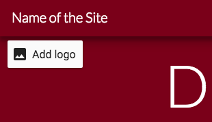
Click the "Add logo" option that appears.
- Select the campus wordmark appropriate for the background color.
Select "Transparent" for the background.
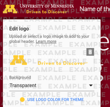
The “Name of the Site” will be auto-filled with the name you chose for your Site document name. To comply with U branding requirements, the site name should not be next to the wordmark. Delete the name so it reads “Enter site name.” The site name will be blank the next time you publish your page.

Creating the Footer
- On the bottom of the page, select "+Add Footer."
- In the text box, paste the following:
- © Regents of the University of Minnesota. All rights reserved. The University of Minnesota is an equal opportunity educator and employer.
- Twin Cities Campus: Parking & Transportation | Maps & Directions | Directories | Contact U of M | Privacy
- Center the text.
- Click the artist palette icon to the left of the text in order to change the section style.
- Select "Emphasis 1" for the style.
New Pages
Unfortunately, most of this work does not carry over when creating new pages on the site. To maintain branding on each page, you will need to repeat some of the setup process for each page you make. Branding is required only on the site’s home page.