This resource is available to U of M faculty, staff, and departmental accounts.
On This Page
Logo Overview
Wordmark
Driven to Discover
Block M
Unit Wordmark Combination
Goldy Gopher
Regents Seal
Logo Overview
Official University logos include the Wordmark, Driven to Discover, Block M, Unit/Wordmark combination, Goldy Gopher, and Regents Seal. The use of these marks on communications helps our audiences to quickly see that it is a University communication.
These logos have specific uses and are not interchangeable. The guidelines explain when and how to use each of the University’s logos.
Before proceeding, note the following:
- All marks are reserved for official University business and may not be used to promote non-University activities or imply endorsement.
- Units may not develop new logos or alter existing logos.
- Third party logos may only be used in conjunction with University marks if a signed agreement between the University and the outside vendor or company has been executed. Any use of third party marks on University materials must be approved by the Office of University Relations. Whenever possible, sponsors or collaborators should be indicated in text, not with a logo.
- To use any logos on merchandise or apparel, see Products and Licensing.
- Student Organizations registered through Student Unions and Activities should review the student group handbook for rules pertaining to logo usage. Registered Student Organizations (RSOs) are not permitted to use University trademarks except for the official RSO mark. See Registered Student Organization Brand Guidelines page for more information.
When multiple internal collaborators or sponsors join forces, the University’s wordmark is the only identity mark/logo that should be used. Additional references and credits can be highlighted in text.

Wordmark

The Wordmark is a graphic element, not a type style. It is a foundational brand element that should be used in all communications to provide a visual indication of its origin or source.
- Do not type the Wordmark or use it in a sentence.
- The Wordmark may not be altered in any way but may be combined with official unit designations through the unit and Wordmark combination logo.
- Each University of Minnesota campus has a distinct version of the Wordmark incorporating the campus’s name.
- Do not use the ® or ™ symbols with the Wordmark.
Placement
- Place the Wordmark (or unit and Wordmark combination logo) in a prominent location on a designed piece where the Wordmark isn't overshadowed by other elements.
- Note: Websites must include the Wordmark in an approved web header; do not duplicate elsewhere on a umn.edu site.
- When using the Wordmark and a unit name as separate elements, they must be far enough apart so as to not appear grouped.
- Do not duplicate the Wordmark on any designed piece.
Buffer Space
Leave a buffer space the height of the capital letter "N" between the Wordmark or Wordmark combination and other graphic elements or the edge of the page/screen.


Minimum Size
Because the Wordmark can appear in vertical (stacked) and horizontal orientations and is customized for each campus, the minimum width is measured against the word “Minnesota."
The word "Minnesota" must be 7/8" (.875") wide.

.
In digital applications, the entire mark “University of Minnesota” must be no smaller than 220 pixels wide on desktop screens and 170 pixels wide on mobile screens.

Wordmark and Other University Logos
- The Wordmark should be used with Driven to Discover on all visual communications when space permits.
- The Wordmark may be used in combination with the Block M in either a horizontal or vertical orientation, except on umn.edu websites where only a horizontal orientation is permitted.
- Goldy Gopher logo(s) may be used on the same piece as the Wordmark but should not be combined into one element.
Campus Designations
Crookston

Guidelines and standards for University of Minnesota Crookston Wordmark.
Duluth

Morris

Rochester

Systemwide
In instances when a communication needs to represent the entire University system, use the version with the campus designations (see below). Campus designations should only be used with the Wordmark and not with any unit combination marks.

Digital Applications
Digital Wordmark files are included in the above download with Wordmarks optimized for a variety of digital displays. The package includes variations of the Wordmark on maroon and gold backgrounds. The Photoshop download includes wordmark variations that have been optimized for use with digital communications. The wordmarks in this file may be enlarged, but not made smaller.
Contact University Relations if you have digital Wordmark needs beyond what is available on this site.
Other considerations when using the Wordmark in digital settings:
- Digital Wordmarks should be used when creating digital ads or other digital content when a template doesn’t exist.
- A responsive Block M/Wordmark combination is incorporated into the official header for all umn.edu websites.
- Do not duplicate the Wordmark on a UMN website.
- Units may not use their Wordmark/unit combinations on UMN web pages.
- HTML email should use either the email templates with the Block M/Wordmark combination included or prominently place the Wordmark within the email.
Social Media
The Wordmark may not be used in the profile image or other graphics created for use on social media. See Social Media Guidelines and Codes of Conduct for more information.
Driven to Discover

Driven to Discover is the official brand tagline of the University of Minnesota. It describes our University and connects all units together under a common platform. All units are encouraged to use Driven to Discover in combination with the Wordmark.
When used as a graphic, Driven to Discover should never be used separately from the Wordmark. It is a graphic element, not a type style. The only exception is in the footer of official University stationery.
Block M
The Block M is one of the most recognized logos in the state. All campuses, colleges, departments, and other units are encouraged to use it.
- Use the Block M in addition to the Wordmark, not as a substitute for it.
- The Block M may be used as a design element by incorporating it into a pattern, cropping, or screening. Any use of the Block M in this manner requires review and approval by University Relations.
- Include a ® on all instances of the Block M except where its size may render it illegible.
- The solid Block M is a widely recognized symbol of the University of Minnesota as a whole. It is strongly recommended for use by University departments, units, and registered student groups.
- The double-outline Block M is used most often by Athletics and is strongly recommended for connecting with those audiences.
The Block M may not be:
- Altered in any way that distorts its proportions.
- Blended or incorporated into other logos except as prescribed in the Wordmark/Unit combination section.
- Used in any color other than Maroon, Gold, Black, White, or Grey.
- Used as a letter in a word.
Cropping of Block M (cut off) is allowed
- Must ensure majority of Block M is visible so that it is still recognized as our mark
- Side cropping is preferred so that the top and bottom of the M are discernable

Block M used with unit or program name is allowed. To do so, use the Block M name template (add link to template).
- The Block M is the most recognized symbol of the University of Minnesota within Minnesota.
- The Block M may not be used as a letter in a word; instead the Block M stands for the words “University of Minnesota”.
- To avoid confusion:
- Use the wordmark in addition to the Block M to differentiate from other universities who also use a Block M.
- When there is the potential for confusion with another entity, include the wordmark or spell out “University of Minnesota” in body copy.
- Spell out names rather than relying solely on acronyms as they take a lot of time and resources to have meaning for audiences.
When naming a program or offering, check that the same name isn't already in use by another University unit or an entity outside the University. Avoid using a name used by another entity if there is potential for confusion.
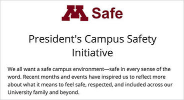


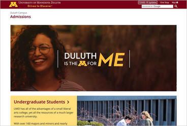
Placement
- Place the Block M in a prominent location on the designed piece (poster, website, flyer, etc.), where it isn't overshadowed by other elements.
- The Block M must be far enough away from other elements so as to not appear grouped.
- Do not duplicate the Block M on any designed piece (poster, website, flyer, etc).
*For more information on branded non-standard outdoor and exterior facing signage, see Communications Requirements.
Buffer Space
Use a buffer space equal to or greater than the height of the Block M's serif to separate the Block M from other graphic elements or the edge of the page. Do not place type or other graphic elements on the Block M.

Minimum Size
- 1/2" (.50")
- 45 pixels
Digital Applications
All University websites on the umn.edu domain are required to use the University's web header and footer. The web header includes the Block M at the upper left along with the Wordmark.
Do not duplicate the Block M in other locations on pages with the official header and footer.
HTML email should use either the email templates with the Block M included or place the Block M in a prominent location within the email along with the Wordmark. Use the appropriate buffer space to separate the Block M from other graphic elements or text.
Do not duplicate the Block M within an email.
Other considerations when using the Block M in digital settings:
- Digital Wordmarks should be used when creating digital ads or other digital content when a template doesn’t exist.
- A responsive Block M/Wordmark combination is incorporated into the official header for all umn.edu websites.
Social Media
The Block M can be used in profile images or other graphics designed for social networking sites.
Unit Wordmark Combination
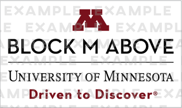
Official University units may connect their name to the Wordmark and Block M in multiple ways. The unit Wordmark combination template, included in the download above, provides specific details for designing your own mark.
When connecting a unit name with the Wordmark and Block M, keep in mind the following:
- Only official University units may connect their names to the Wordmark.
- Student groups are not permitted to use these templates.
- The unit name may not exceed the width of the Wordmark and should be limited to a maximum of two lines.
- Use Driven to Discover in connection with the Wordmark whenever possible.
- The combination of a unit name and Wordmark may be no taller than it is wide.
- Use only one unit name in connection with the Wordmark or Block M. Do not combine both a college name and a department name.
- Goldy Gopher or the Regents Seal may not be used in place of the Block M.
- The Block M may be used above or to the left of a unit name.
- Unit and Wordmark combinations are not allowed on University websites.
- When using a unit name separate from the Wordmark, the Wordmark must be included somewhere on the designed piece (poster, flyer, etc.). For example, a postcard may contain the Block M/unit combination on the front and the Wordmark on the back.
If you are interested in using the Block M unit name combination (below), please contact University Relations.

Goldy Gopher
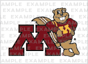
Goldy Gopher logos should be used to represent the Twin Cities campus in informal communications. There are three official versions of the Goldy Gopher logo: Running Goldy, Leaning Goldy, and Goldy Face.
- Use Goldy in addition to the Wordmark, not as a substitute for it.
- Goldy may be used as a design element by incorporating it into a pattern, cropping, or screening. Any use of Goldy in this manner requires review and approval by University Relations.
- Include a ® in all uses, except when the size of the ® renders it illegible.
Buffer Space
Use a buffer space equal to the height of the Block M's serif to separate Leaning Goldy from other graphic elements or the edge of the page. For Running Goldy, use a buffer space equal to the height of Goldy's fist. For Goldy Face use a buffer space equal to the height of Goldy's ear.
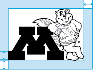
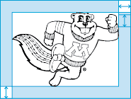

Minimum Size
- 3/4" (.75"): for all paper sizes
- 150 pixels
Minimum Size For Full-Body Goldys
- 3/4" (.75"): for all paper sizes
- 150 pixels for digital
Minimum Size For Goldy Heads
- 1/2" (.5"): for all paper sizes
- 100 pixels for digital
Digital Applications
Goldy Gopher represents the Twin Cities campus in informal communications. It does not replace the required Block M and Wordmark combination for digital communications.
Social Media
Goldy Gopher represents the Twin Cities campus in informal communications. Goldy Gopher is not to be used in place of the Block M in social media profile graphics.
Regents Seal

The Board of Regents adopted the Regents Seal in 1939 as the corporate seal of the University of Minnesota. The Latin motto omnibus artibus commune vinculum means “a common bond for all the arts.” The lamp represents the metaphysical sciences, the telescope the physical sciences, the plow the industrial arts, and the palette and brushes the fine arts.
Unlike the Wordmark or Block M, the Regents Seal is not available for widespread use. The Regents Seal is reserved for official awards, gifts, event materials, and documents involving the Board of Regents or bearing the signature of the president or a vice president, chancellor, dean, or member or officer of the Board of Regents.
Contact University Relations to request approval to use the seal.
Related Resources
Assets
- Favicon
- Logos and Marks for Microsoft Word
- System Identity Style Guide
- University Social Media Graphics
Guidelines
- Photography Guidelines
- Branding Mobile Apps
- Colors and Type
- Products and Licensing
- Signs and Graphics
- Web Requirements